Case study — Brand, web, campaign
Velonna
The situation
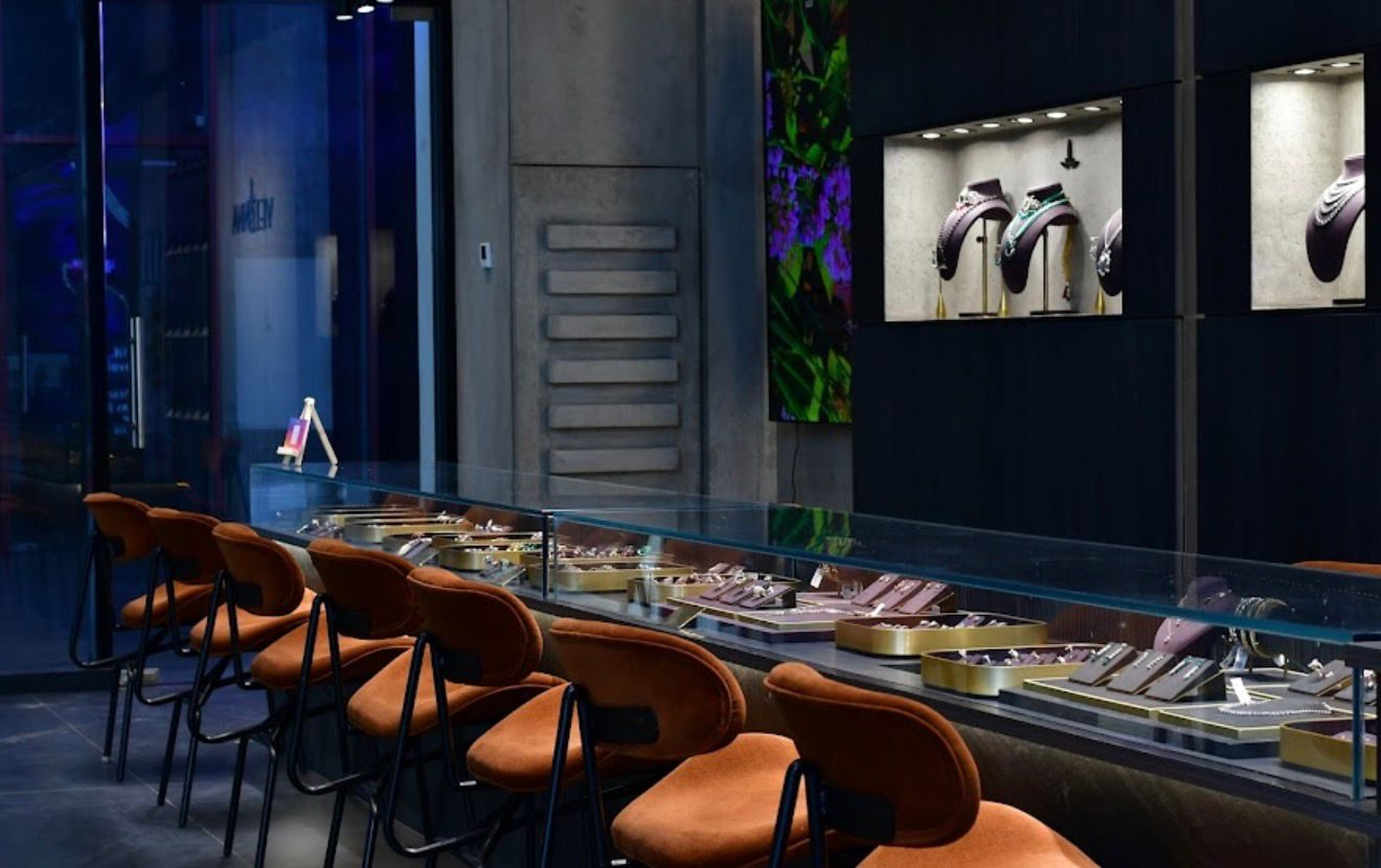
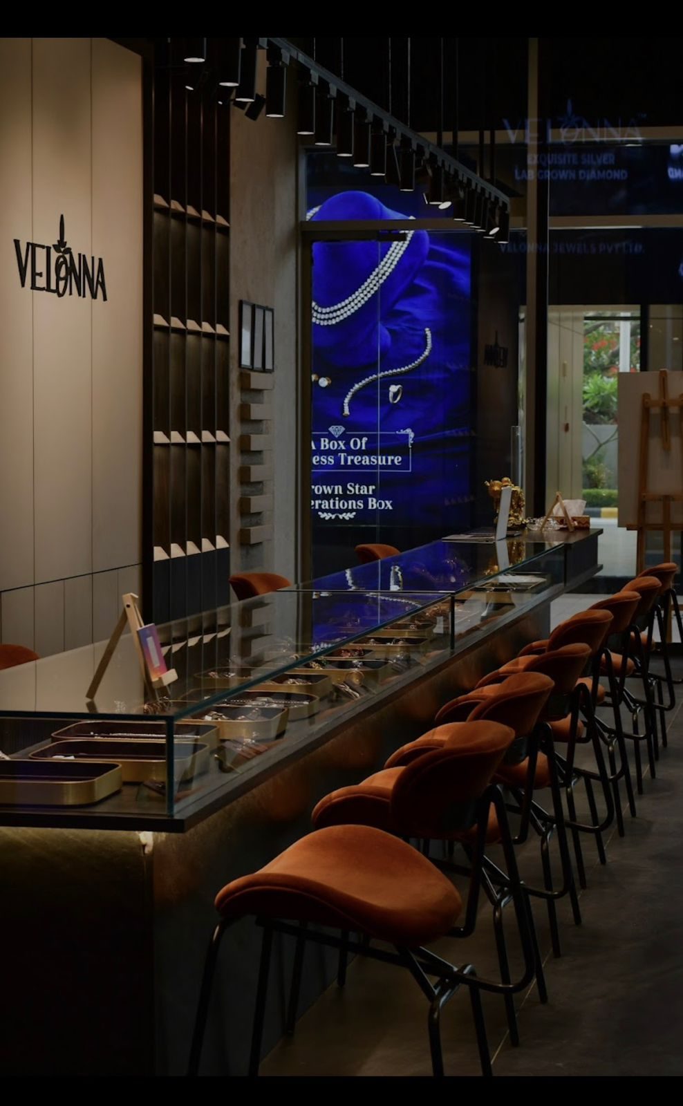
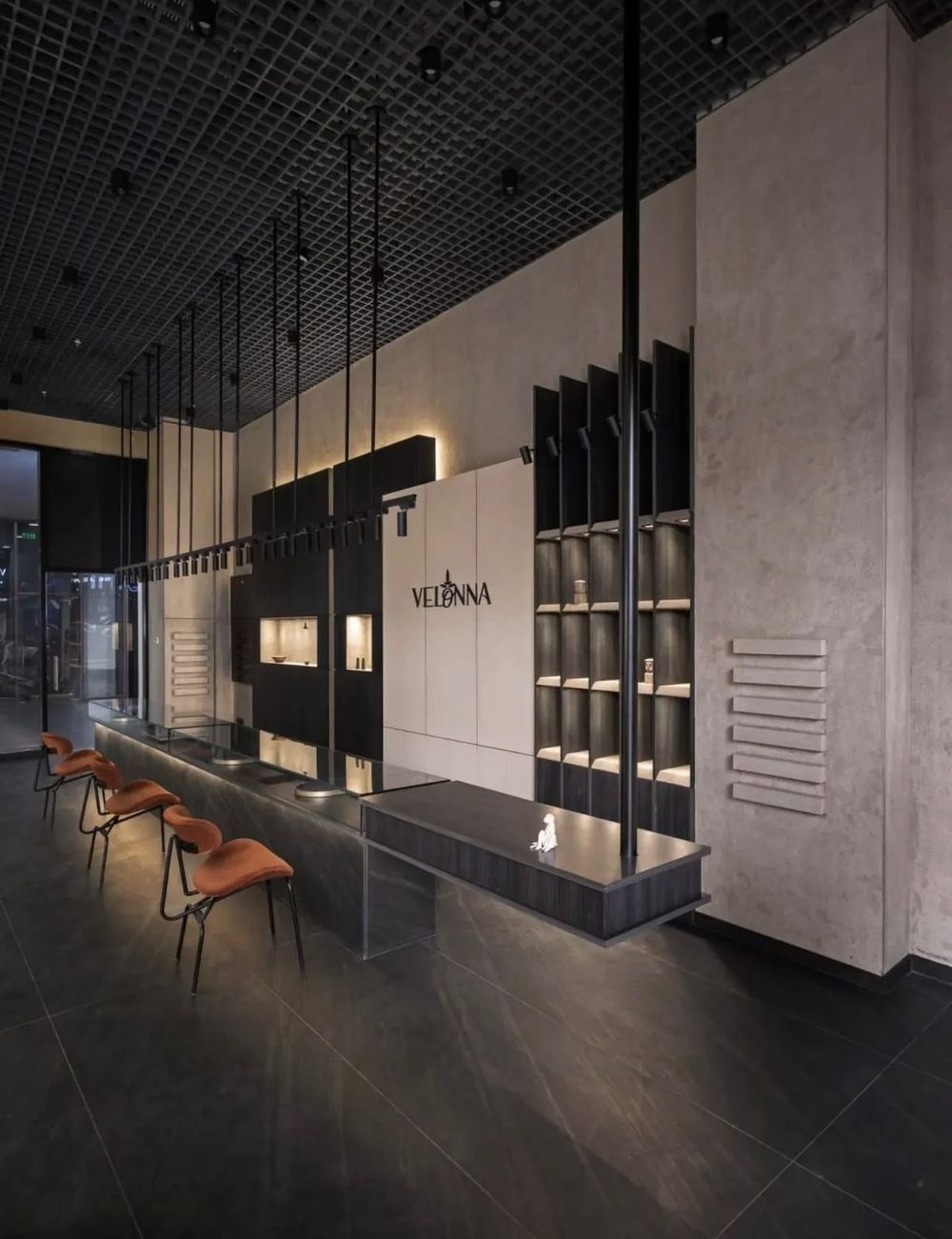
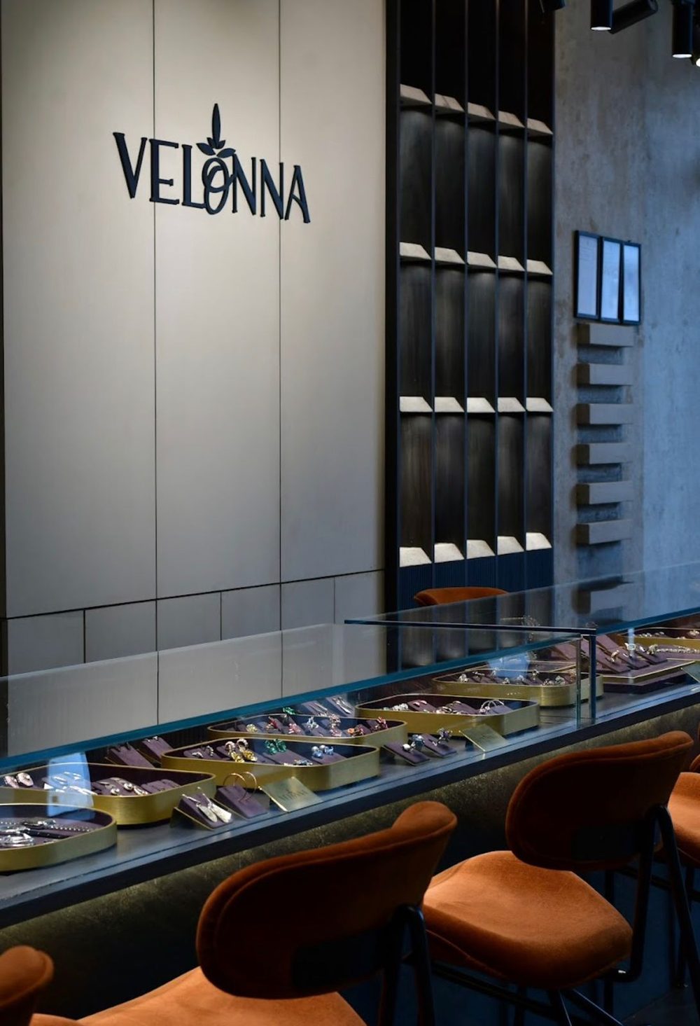
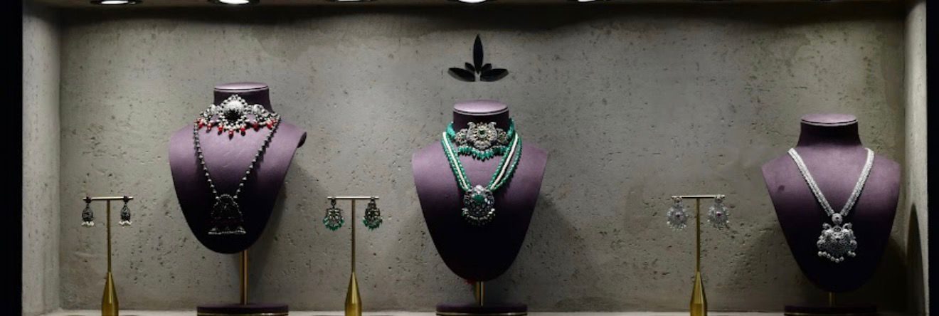
A hundred and two years of selling jewellery from one shop, and not a rupee of it online. You walked in, you sat down, you were shown. That is how Velonna earned its trust, and it's why the shop looks the way it does — the long counter, the stools, the wall of pieces waiting to be brought down.
This year the family decided the second century would start online, and asked me to take it there.
The store — where the trust was built
What I didn't touch
The identity. Velonna's logo was made with an astrologer, in keeping with the family's beliefs, and a century of customers know it exactly as it is. So there are no new brand guidelines in this project, and there were never going to be. I worked inside the mark and its colours as given.
For a brand this old, that's the respectful design decision — not the missing one.
Going online
A website, the campaigns to send people to it, and the pictures to run them with.
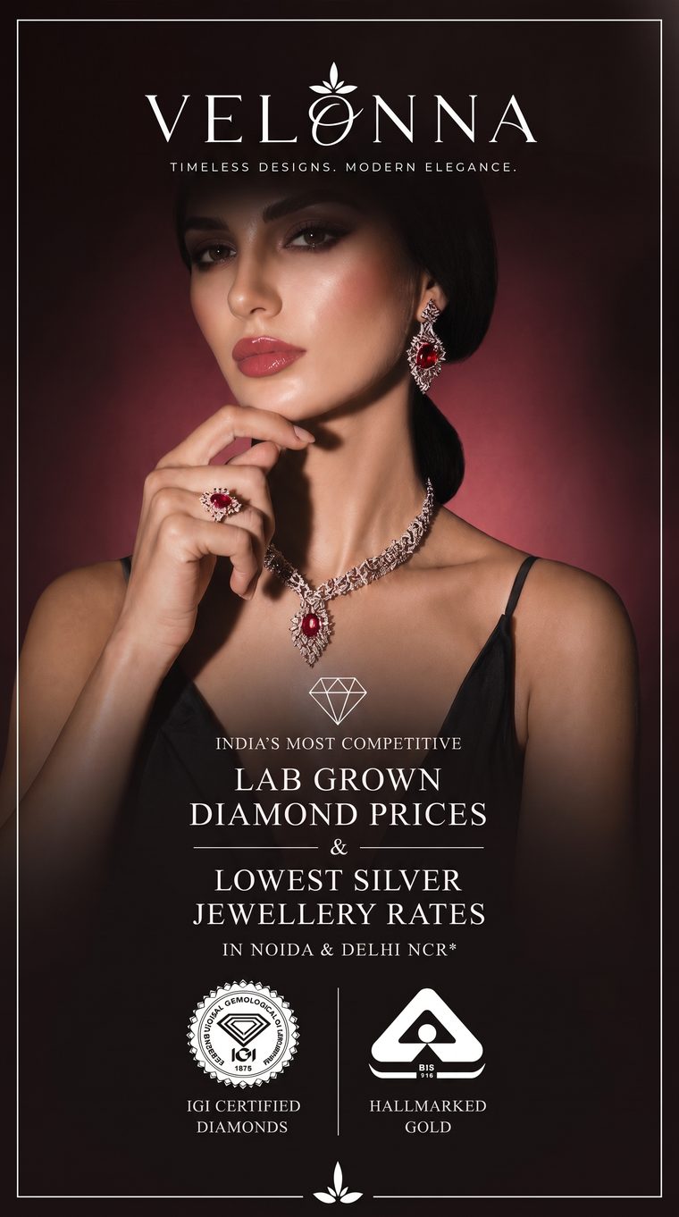
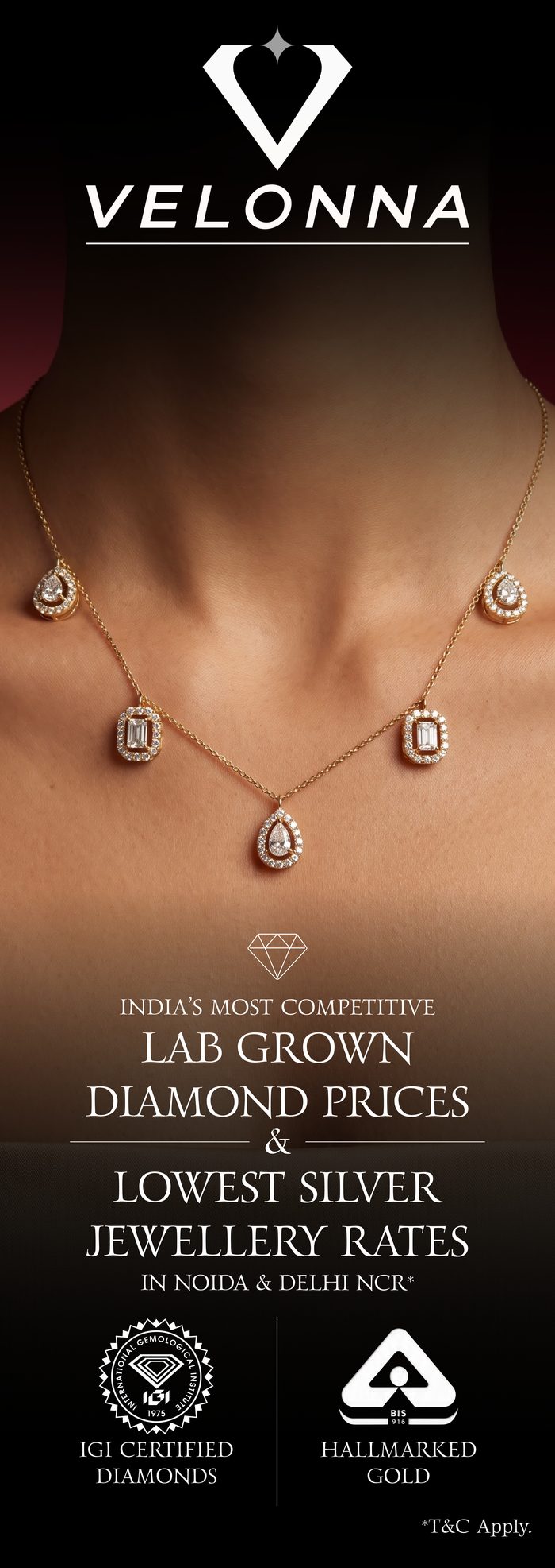
The website is Velonna's first. Lab-grown diamonds and silver, with the prices stated plainly — because plain prices are the offer: India's most competitive on lab-grown, the lowest silver rates in Noida and Delhi NCR, IGI-certified stones, hallmarked gold. I built it, then ran the paid campaigns that send people to it.
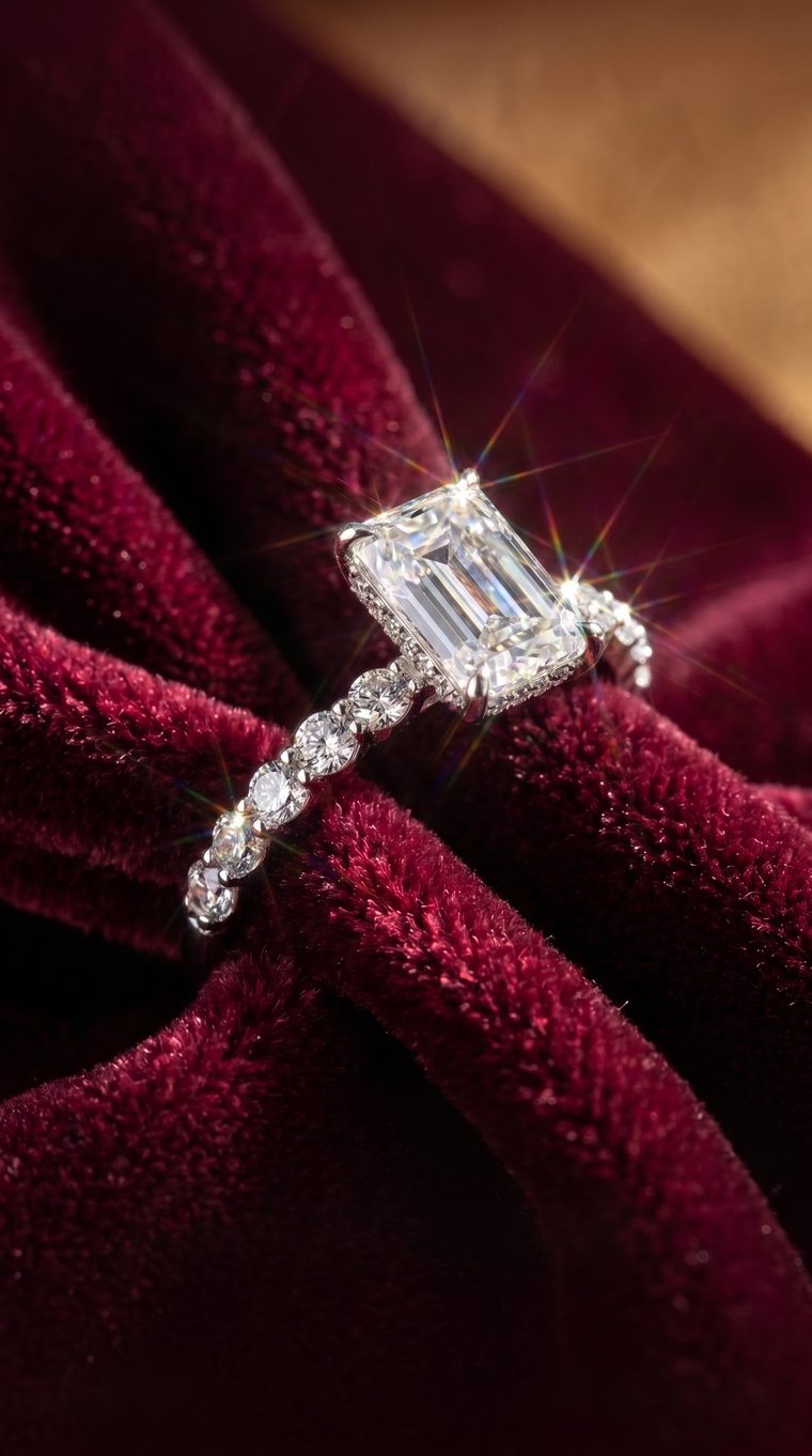
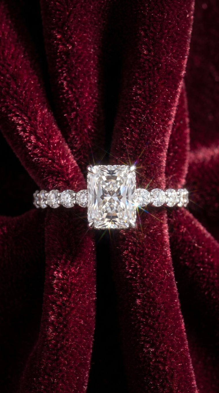
The product visuals give a lab-grown stone the attention a mined one gets. The long-format creative is the ad built to be read top to bottom, the offer in numbers.
Where it stands
The shop is still the shop. The website is up, the campaigns have run, and for the first time in a hundred and two years, Velonna can be found by someone who has never walked past it.