Case study — UI / UX · Usability testing
Magic Lesson
Mr. Plant catches the sun's rays in his big green leaves and turns them into food. When he has caught enough, he grows fruit — for everyone.
What does Mr. Plant do with the sun's rays?
The problem
School children are handed the same dense textbooks their parents were, in a decade that has rewired how they pay attention. A page about photosynthesis is competing with feeds engineered never to bore anyone. The material isn't too hard for them. It's too still.
The idea
Magic Lesson takes whatever a child is already being taught — photograph the pages, or upload the book — and rebuilds it as an illustrated story that reads itself aloud, cut into pieces small enough to finish, with a question at the end of each one. Streaks, points and an AI tutor called Witch way keep it feeling like a game.
The product — six screens
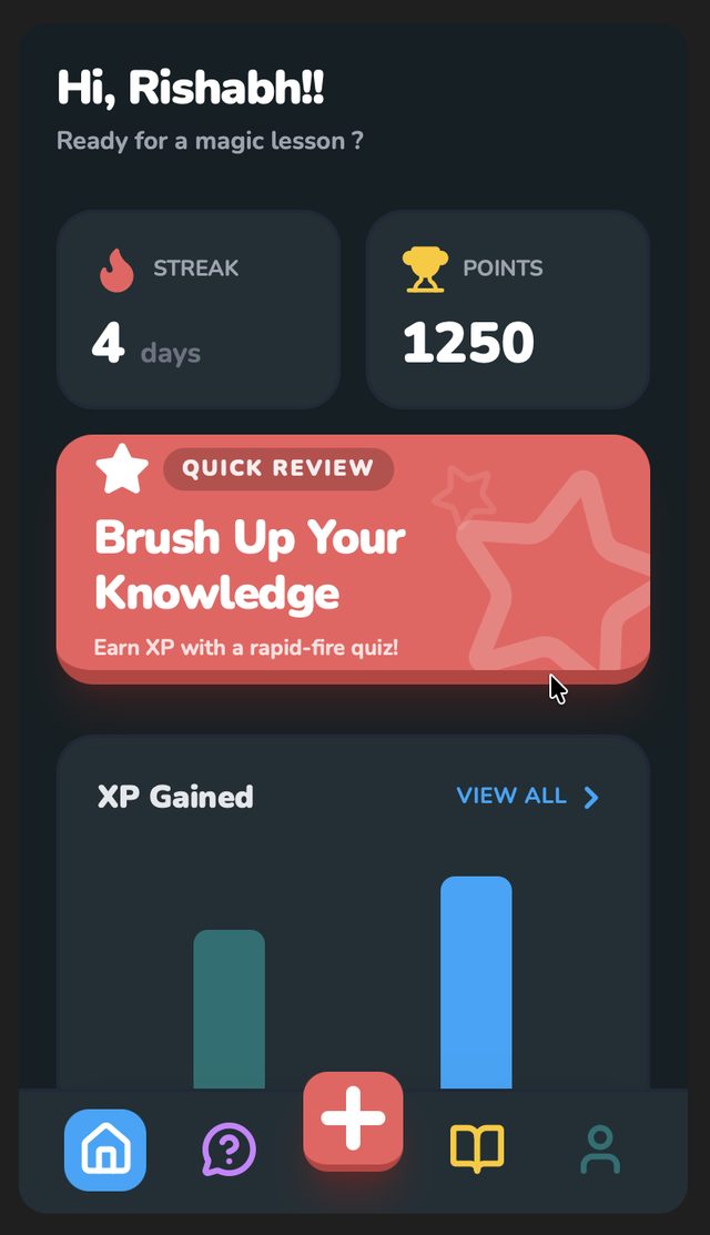
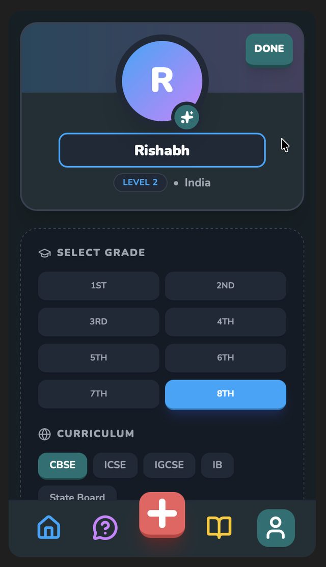
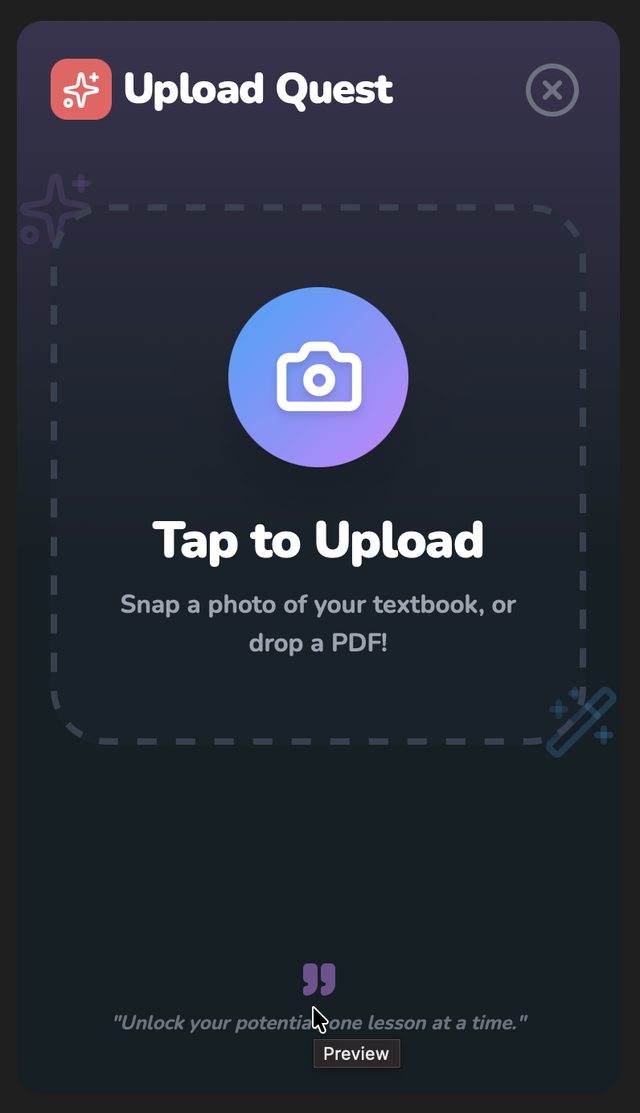
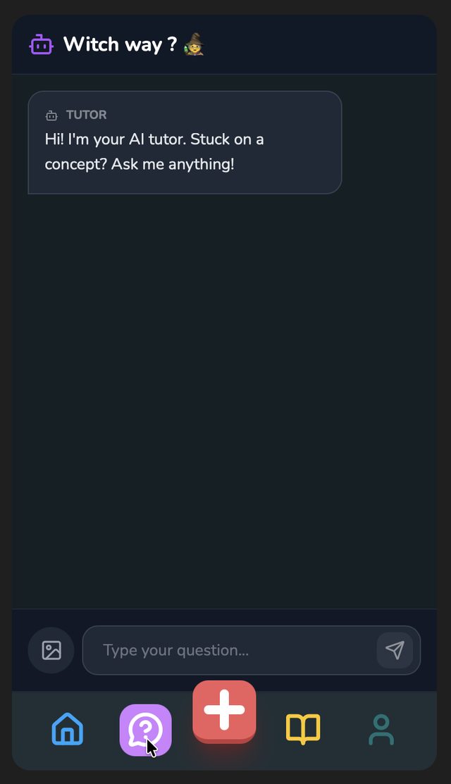
A working prototype, dark by default. Everything lives one tap from a five-icon bar: home, tutor, new lesson, history, profile.
How it works
- 01CapturePhotograph the lesson or upload the textbook. No curriculum to pick first.
- 02RetellThe lesson is rewritten as a story with characters, illustrated as it goes.
- 03NarrateIt reads itself out loud — at 0.75×, 1× or 1.25×.
- 04ChunkThe story arrives in pieces short enough that finishing always feels possible.
- 05RecallEvery chunk ends with a question. Answering it opens the next part.
The test
Eight students. Three tasks. Think out loud.
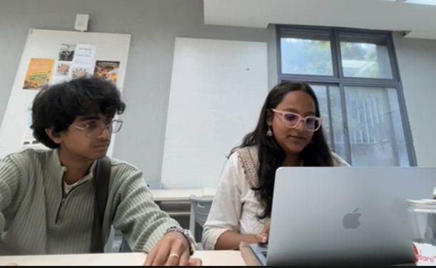
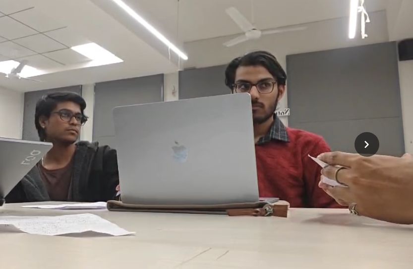
Formative sessions in a quiet room: a moderator, a note-taker, the prototype on a laptop, twenty to thirty minutes each, recorded with consent. Nobody was told where anything was. Each task was read out from a card, and people said what they were thinking as they went.
- Update your personal information so the AI can personalise your lessons.
- Find the option to start a new lesson and begin learning.
- Find your learning history and check your latest quiz scores.
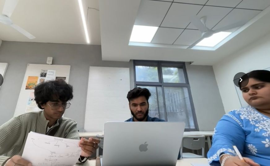
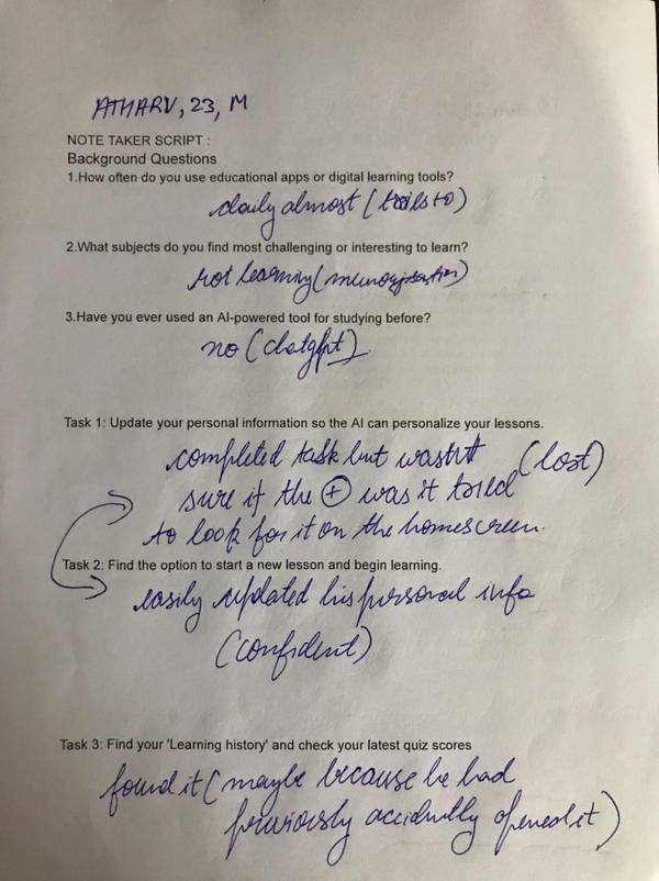
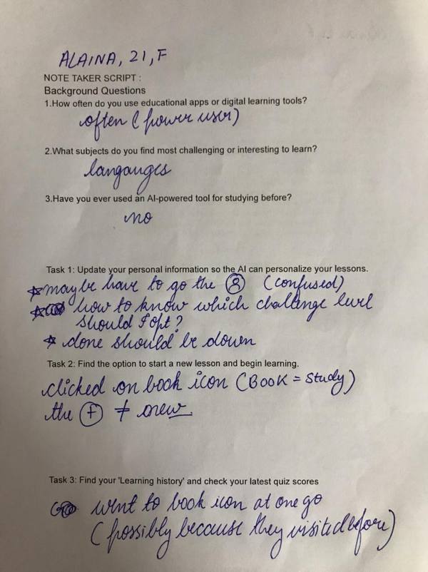
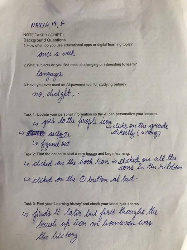
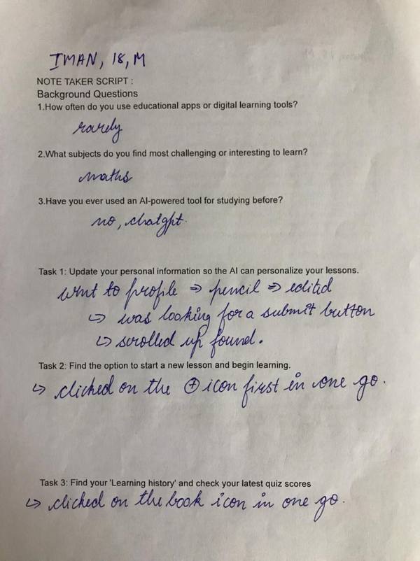
Note-taker sheets — one per participant, filled in live: path taken, hesitations, what they said.
What the taps showed
On the home screen, people looked for their history in the wrong place.
Taps pile onto the house and book icons — and onto the Brush Up Your Knowledge card, which more than one person tapped looking for past lessons. The card looks like a record of what you've done. It isn't; it's a quiz.
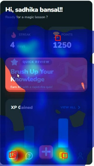
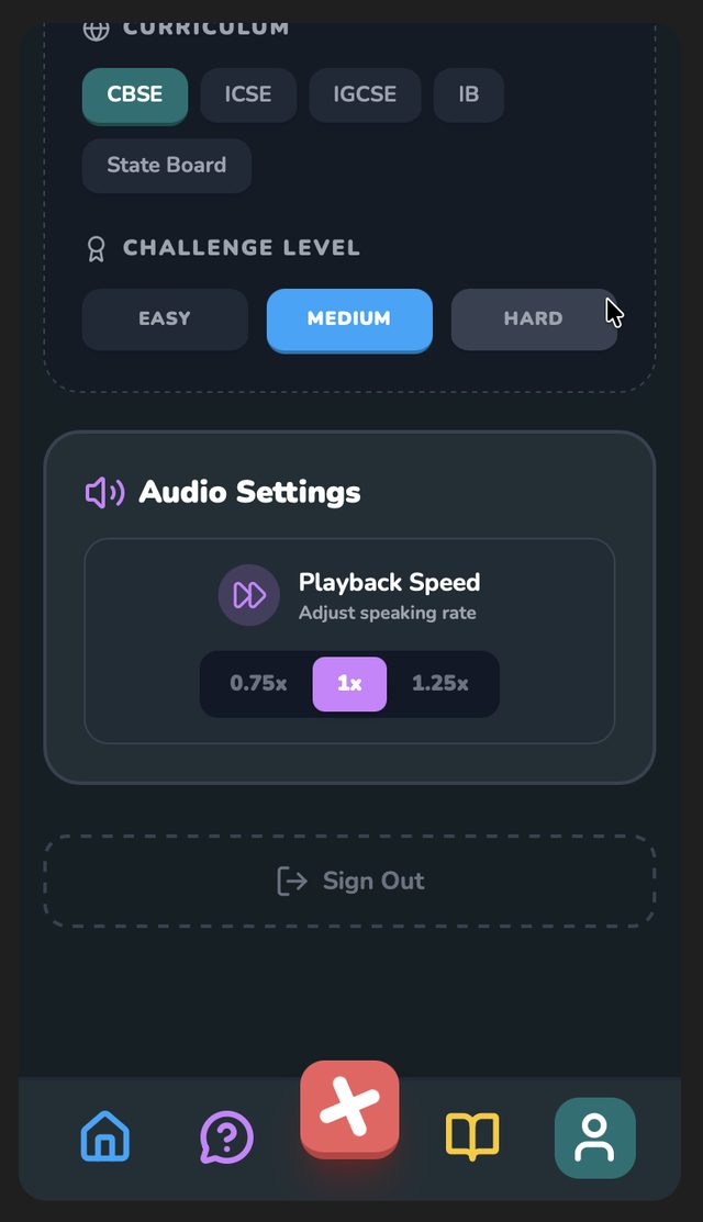
In profile edit, the hot zones are at the bottom — and the Done button was at the top.
People spent their time on Challenge Level and Playback Speed, the last settings on the screen. By the time they were finished, the Done button, pinned to the header, had scrolled out of sight. Taps on it only appear after a scroll back up.
What we found
lost the Done button.
Six of eight participants scrolled down to change a setting, finished, and then couldn't find how to save. Two needed a prompt. Several assumed their changes had saved themselves. One expected the button to be at the bottom, where every other app puts it. It was the single biggest drag on every score in the survey — and the easiest thing on this list to fix.
-
Done scrolls out of viewProfile edit
Pin the header so Done stays on screen — or auto-save, with a visible "Saved".
High -
The book icon means "study", not "history"Navigation bar
A clock or timeline icon, with the word History under it. Several people opened the book expecting to start a lesson.
High -
The + doesn't say what it doesNavigation bar
Label it New lesson, and let the modal's first line explain that uploading a page makes one. One participant tried every icon in the bar before this one.
High -
Nothing confirms a saveProfile edit → Done
A short toast — Profile updated — so nobody goes back to check.
Medium -
Easy, Medium and Hard mean nothing yetChallenge level
One line under each: revision · standard pace · exam prep.
Medium
The scores — ten questions, out of five
Each participant rated the session on a ten-item scale afterwards. Design was the standout: every single person rated it Good or Excellent. Error prevention was the floor — the Done button, again.
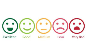 The scale, as printed on the survey
What held up
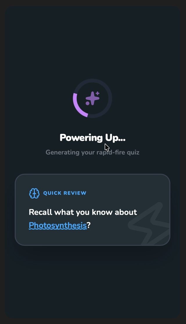
- "Powering up…"The loading screen said exactly what it was doing. Nobody was confused while a quiz generated.
- XP, Streak, Points, Witch wayLanguage that needed zero explanation from anyone in the room.
- The dark interfacePraised by all eight. Soft cards on a dark ground, nothing competing for the eye.
- Playback speed0.75×, 1×, 1.25× — a flexibility people noticed and liked.
- The X on Upload QuestEveryone found it. Nobody felt trapped in the upload flow.
- Help as a tutor, not a FAQ"Stuck on a concept? Ask me anything" — one tap away, inside the flow.
Against Nielsen's ten
An expert review ran alongside the sessions. Three heuristics needed work — and testing pointed at the same three.
- Visibility of system statusGood
- Match with the real worldModerate
- User control and freedomGood
- Consistency and standardsNeeds work
- Error preventionNeeds work
- Recognition over recallGood
- Flexibility and efficiencyExcellent
- Aesthetic, minimalist designExcellent
- Recovering from errorsNeeds work
- Help and documentationGood